ProvokedGamer,
@ProvokedGamer@lemmy.ca avatar

My favourite ones the second one because I feel it’s the right amount of simplification without oversimplifying. The first one is alright though.

yttrium,

Firefox wasn’t around during the time of the ancient greeks, silly. They used Netscape Navigator

XTornado,
hungryphrog,

Dammit, some Spartan dude hacked my pc again. Be careful to not install files from sketchy websites, or you might get a Trojan!

neeeeDanke,

are you triyng to reignite the pillar discourse?!

Swedneck,
@Swedneck@discuss.tchncs.de avatar

previous logo remains superior, it’s got lovely colours and a nice balance of simplicity and detail.

the classic logos just look quaint and the current logo kinda feels… empty?

heimchen,

Love the new Icon

Oha,
@Oha@lemmy.ohaa.xyz avatar

Am I the only one who likes the new Logo? I mean its simplified but you can still clearly recognize the Red Panda. Plus I like purple

yogaxpto,

But it is supposed to be a fox!

Oha,
@Oha@lemmy.ohaa.xyz avatar

nope
Edit: Dug a bit deeper and found the answer on Firefox’s website

Dangdoggo,
@Dangdoggo@kbin.social avatar

Wow I didn't know that, the logo definitely looks more like a fox though...

Swedneck,
@Swedneck@discuss.tchncs.de avatar

yeah i kinda feel like they’re just making it up? like it’s clearly a red fox, red pandas don’t have a long snout like that and are overall rounder.

Renevar,

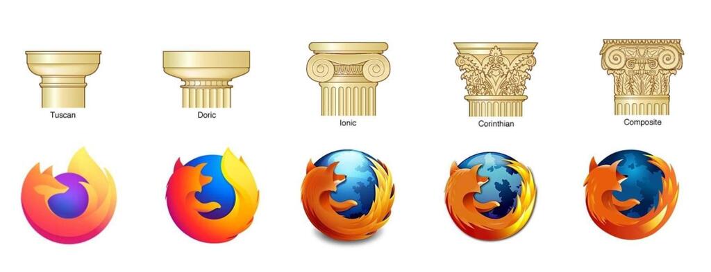
? In the very question you linked they state without a doubt that it’s depicting a fox tho

“hi, the logo is clearly depicting a fox - however the red panda (common name: firefox) is also a cute mascot for our browser”

That means they have some red panda mascots (it seems like they use to actually have some live cams that you could watch them on too!) But the logo itself does infact depict a fox

MJBrune,

So it’s a fox but their mascot is a red panda.

casmael,

Actually it’s supposed to be a fox

independantiste,
@independantiste@sh.itjust.works avatar

You’re not the only one, people especially in niche spheres like Linux are very nostalgic of a certain era in computing and refuse to accept that change happens. For example there are people who absolutely hate apps with the slightest bit of white space even though that was proven time and time again to be more accessible and readable

gamermanh,

Change can happen, that’s fine

We can also dislike modern logo design trends, those are 2 completely different topics at hand

Neve8028,

I think the one before the current one is my favorite. I feel like the current one is a bit blocky while the previous has a little more detail but still looks good when shrunk down. I don’t hate the current one, though.

  • All
  • Subscribed
  • Moderated
  • Favorites
  • random
  • uselessserver093
  • Food
  • [email protected]
  • aaaaaaacccccccce
  • test
  • CafeMeta
  • testmag
  • MUD
  • RhythmGameZone
  • RSS
  • dabs
  • oklahoma
  • Socialism
  • KbinCafe
  • TheResearchGuardian
  • SuperSentai
  • feritale
  • KamenRider
  • All magazines