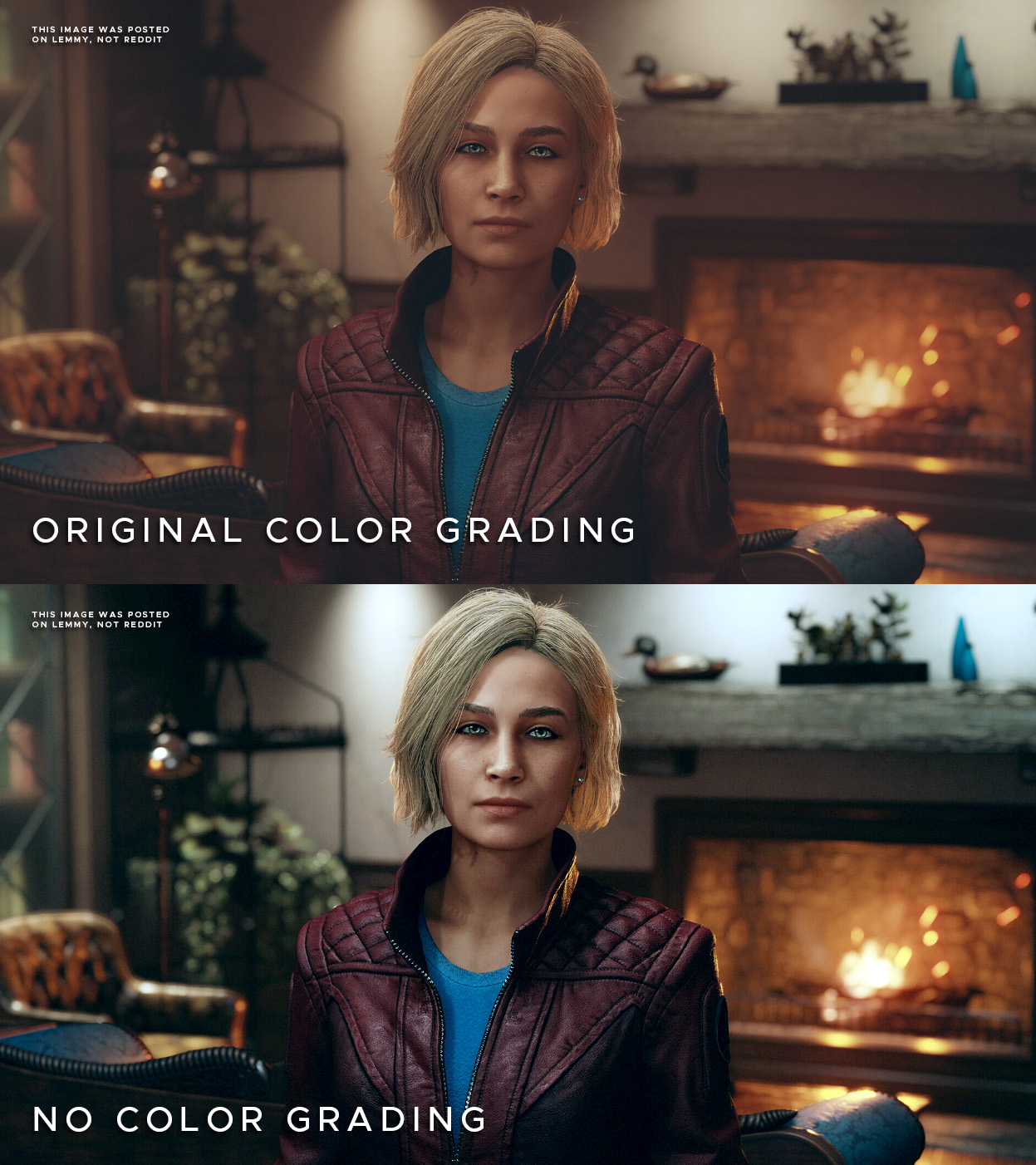
PotjiePig, (edited )

The first one looks natural to me. The second grade looks like a 1st year film school grade where they think the full range has to be used at all times. In a soft well lit room the contrast would never be that high.

The intention was clearly to make it look like a warm interior, adding all those grungy green tones make it look like she’s standing by a window. I dunno the context of the room, but number 1 looks way better to me…

Edit: Final thought - crushing blacks like that, from a game perspective means you may miss details that may have been meant to be seen. But power to you! Options are always better.

skankhunt42,

Eyesight is wild, personally the second one looks more realistic to me.

But you are right, options are always better

Graylitic,

Lighting mods are always nice after they get good. It’s amazing how drastically lightweight mods can visually transform Bethesda games like New Vegas, Fallout 4, and Skyrim.

skankhunt42,

Luckily for us gamers New Vegas is not a Bethesda game

IWantToFuckSpez,

Doesn’t the original make sense because they are in a room full of warm light sources?

pwnstar,

Yes.

There is literally no white point reference either, so the altered image is just assumed.

cloudless,
@cloudless@feddit.uk avatar

Fallout New Vegas is only playable with the piss filter disabled (via mods).

Starfield looks ok, I think the colours add a bit of alien atmosphere.

massive_bereavement,
@massive_bereavement@kbin.social avatar

But if there's no piss filter, how do you know you're playing Fallout?

JokeDeity,

I don’t think the original is that bad honestly, but I do install reshade in just about every game I play so I can understand. Bottom picture has too high contrast though and levels need adjusted.

apinanaivot,

It’s a matter of taste. I set the contrast so that the brightest pixel in the scene is 100% white, and the darkest 100% black, so there is the highest possible dynamic range (and nothing is over or underexposed). The vanilla kind of looks like there is mist everywhere since it’s so washed out.

glimse,

You may prefer that contrast but I wouldn’t call it “natural lighting”

I don’t mean this negatively at all but it reminds me of the photo edits I would make when I first discovered that stuff looks cool if you crush the blacks a bit. That’s not how stuff looks with our eyes but it does look nice

IWantToFuckSpez,

But nothing in reality is 100% black except Vanta Black paint. A painter who makes realistic paintings will never use pure black except for mixing.

emptyother,
@emptyother@programming.dev avatar

But pc screens cant show pure black either. By using the full range of colors, we have more range to show different shades of black without creating a banding effect.

Graylitic,

OLEDs can get damn close.

emptyother,
@emptyother@programming.dev avatar

I prefer crushing the whites (a bit of overexposure) than crushing the black. It feels more realistic.

Do people have differences in how bright they see the worlds colors, I wonder? I know, of personal experience, that colors for a single person can literally look bleaker when one is depressed. And then theres people with better night vision than others.

beta_tester,

The color grading picture looks like it has a wrong white balance

apinanaivot,

That’s how you know constellation headquarters are in Mexico.

  • All
  • Subscribed
  • Moderated
  • Favorites
  • random
  • uselessserver093
  • Food
  • aaaaaaacccccccce
  • [email protected]
  • test
  • CafeMeta
  • testmag
  • MUD
  • RhythmGameZone
  • RSS
  • dabs
  • Socialism
  • KbinCafe
  • TheResearchGuardian
  • oklahoma
  • feritale
  • SuperSentai
  • KamenRider
  • All magazines