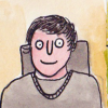
I refined FixedFun's mascot design for Kbin. Thoughts? Feedback? (More pics/alts in post!)

I really loved @FixedFun 's idea for the kbin mascot, so I decided to refine it a bit and make some color alternatives. All credit to them for this wonderful idea! I merely refined it. Note, the circles beside the logo are just a color pallete swatch, not actually meant to be apart of the logo.

Here is some alternatives as well as a phone screen mockup
Here is Fun's next to mine

As the kbird, maybe his name could be Ben, or Bin, or Binny the bird? Binjamin is pretty hilarious

details: font is poppins. program is adobe illustrator.

UPDATE: Thoughts on this one?

ZeroZeroOne,
@ZeroZeroOne@kbin.social avatar

I just cant help but see the balding man...

minnieo,
@minnieo@kbin.social avatar

i tried so hard not to while making this 😭

blivet,
@blivet@kbin.social avatar

If the logo was flipped so that the bird was facing to the left it might help. At least for those of us who read from left to right, the first thing we see when scanning the image is the back of the bird’s head instead of the beak.

Kill_joy, (edited )
@Kill_joy@kbin.social avatar

It's funny. On the original I think it was facing left and a case was made for updating it to face the right for readers who read left to right. The thought being that it would be looking forward rather than backward.

It's interesting - lots of differing perspectives on how we view art and marketing.

blivet,
@blivet@kbin.social avatar

You’re right, I had seen the original but didn’t remember that the newer version was flipped.

bitwise, (edited )

Don't fight it, embrace the neck rolls.

🤢

Niello,

If you adjust it a bit you could probably get another bird in there too. The pointy white part as the beak and the black beak as the wing.

fujiwara,
@fujiwara@kbin.social avatar

Oh no... 😅

KotoWhiskas,

Can't unsee it now

minnieo,
@minnieo@kbin.social avatar

does this look better and hopefully help make the bald man go away?

Niello, (edited )

It looks better (cuter!) but I'm not sure if the bald man went away. Maybe if you add a little line to make the upper and lower beak clearer? Maybe a little smile.

ChrV,
@ChrV@kbin.social avatar

Good work mate, personally I'd like it more with black eye though.

minnieo, (edited )
@minnieo@kbin.social avatar

thanks! how is this?

ozen,
@ozen@kbin.social avatar

i love this, it's so cute! great colours choice too.

minnieo,
@minnieo@kbin.social avatar

thanks :D

InterSynth,
@InterSynth@kbin.social avatar

I like this version a lot!

minnieo,
@minnieo@kbin.social avatar

me too :D

Contortion,

I like this, but I'd prefer a solid background (just personal taste but the color crossfade backgrounds always remind of WordArt).

minnieo, (edited )
@minnieo@kbin.social avatar

i made some solid versions too :)

HidingCat,

I love this, I hope both Kbin and this mascot takes off! Binny's a wonderful name for a birbie too!

minnieo,
@minnieo@kbin.social avatar

If Binny is short for Binjamin, I'm totally sold

digitallyfree, (edited )
@digitallyfree@kbin.social avatar

x

digitallyfree,
@digitallyfree@kbin.social avatar

I also tried out a rounded base to avoid the parallel lines between the bottom of the base and the mascot itself, which are a lot more obvious with the border in place.

minnieo,
@minnieo@kbin.social avatar

though it does stand out more, i felt like adding a stroke makes it look more unrelated and pasted on if that makes sense? like someone took a random bird icon and threw it on a gradient bg. so i wanted it to feel a little bit more integrated. i dont mind the stroke as much as i thought upon seeing your version, tho. i added a stroke to mine just to see and i dont think its too bad

digitallyfree, (edited )
@digitallyfree@kbin.social avatar

x

minnieo,
@minnieo@kbin.social avatar

what do you think about this? i tried to get rid of the parallel lines

digitallyfree, (edited )
@digitallyfree@kbin.social avatar

I definitely like the "toot" of noise and the gradient stroke. On the other hand the top and bottom left corners feel a bit empty as there's a lot of stuff going on at the right mid section of the logo.

Teal,
@Teal@kbin.social avatar

I like both versions (different eyes) very much. Nice work minnieo!

minnieo,
@minnieo@kbin.social avatar

thanks :)

hyperspace,
@hyperspace@kbin.social avatar

Is this a mascot in the same way that the mastodon is mastodon's mascot and Snoo is Reddit's mascot? For some reason this mockup really looks like an app icon haha

1Fuji2Taka3Nasubi,

I agree. IMO a mascot is something you can make a plush toy out of.

DessertStorms,
@DessertStorms@kbin.social avatar

Like the colour choice!
Can't help but see a sumo wrestler looking up to the left before I see the bird though, sorry! 😁
I think of all the versions in the thread this one probably least so.

chernoberl,

Lovely!

Regarding the name: In a lot of languages, cockatoos are spelled with a K, e.g. German „Kakadu“, Dutch „Kaketoe“, so a name starting with K would make sense, and there’s quite some Germanic names start with K, e.g. Karl, Klara, Katharina, Konrad, and many more. I personally like Klara, sounds like something a cockatoo would say on repeat. Just an idea.

FriendOfFalcons,

I love cute birdies. And this logo looks so awesome. Thank you so much for sharing your work :)

minnieo,
@minnieo@kbin.social avatar

thanks @FixedFun, it's their idea and design, I only worked on top of it :)

mihnt,
@mihnt@kbin.social avatar

Still say it should be named kben.

comedy,
@comedy@kbin.social avatar

I like it, very nice 👍

minnieo,
@minnieo@kbin.social avatar

thank you C:

v13,
@v13@kbin.social avatar

I think it's really nice!!!

minnieo,
@minnieo@kbin.social avatar

tysm!

  • All
  • Subscribed
  • Moderated
  • Favorites
  • random
  • [email protected]
  • uselessserver093
  • Food
  • aaaaaaacccccccce
  • test
  • CafeMeta
  • testmag
  • MUD
  • RhythmGameZone
  • RSS
  • dabs
  • oklahoma
  • feritale
  • KamenRider
  • Ask_kbincafe
  • TheResearchGuardian
  • KbinCafe
  • Socialism
  • SuperSentai
  • All magazines