[Feedback] New logo for the profile without pic

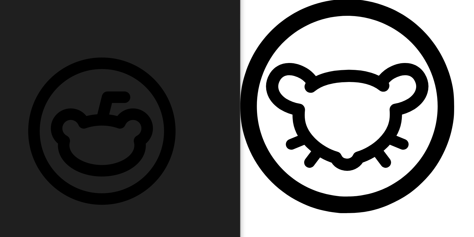
Yo guys, I’m working to recreate the original no profile pic from reddit (the one on the left) but without any color shades for now, and I came up with this pic (the one on the right), is it any good for you guys?

(I’m not a designer or in the industry at all) So I’m not that used to this kind of softwares, tell me how I could improve it and I will try my best to do so.

When I get a design that it’s good and liked by everybody, or at least most of us, I will shade it using the original colors or somethings that we like better and release it to use for free on Infinity

fisco,
@fisco@lemmy.ml avatar

Its already been changed…

https://lemmy.ml/pictrs/image/58a76c78-dc61-44b5-a253-8b8b64c507e1.jpeg

Whilst what you have done is nice, seems this area has already been Lemmyfied…

simonweiss,
@simonweiss@lemmy.ml avatar

I’d recommend making the circle stroke width equal to the head’s stroke width, like in the original icon. Other than that it’s a perfect substitute imo

MazonnaCara89,
@MazonnaCara89@lemmy.ml avatar
6daemonbag,

Tbh that looks a little heavy. I don’t think the strokes need to be the same width, but maybe making both thinner could work. It doesn’t need to be a replica-of-reddit-but-lemmy

  • All
  • Subscribed
  • Moderated
  • Favorites
  • random
  • uselessserver093
  • Food
  • aaaaaaacccccccce
  • test
  • CafeMeta
  • testmag
  • MUD
  • [email protected]
  • RhythmGameZone
  • RSS
  • dabs
  • Ask_kbincafe
  • feritale
  • TheResearchGuardian
  • KbinCafe
  • Socialism
  • oklahoma
  • SuperSentai
  • KamenRider
  • All magazines