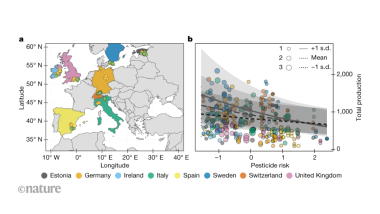
That graph in the thumbnail is absolutely terrible. Why is ±stddev displayed using different sized dots. Did they put the map for people who don’t know where Italy is? What is the x axis supposed to be? Production of what?
I mean, I’m sure it’s explained in the article, but graphs should have a minimum amount of self-explanation.
It defenitely needs improvement. But I think it’s not too bad, sometimes your data is complex and is not easy to make one single overview figure, especially if spatial data is involved. The figure caption probably makes it clearer…
I guess the std dots were selected because error bars would mess the figure up entirely, as there are many data points. The map is probably used to link the color to the dots, but I mean we have a tool called “legend” for that. If that’s the case, what are the colored dots on the map? And yeah, the X-Axis lacks a unit.
The longer I looo the more difficult it gets, and I would expect more quality by a Nature peer review…


Add comment